
This is an archive post. It will not be updated.
Can you imagine the internet without photos, illustrations and other graphic elements?
For people who are visually impaired or blind, or who have a very slow internet connection, this is unfortunately everyday reality, because many images
have no image description in the form of an alternative text. As a result, these people are denied essential content.
In this guide, you will learn how to write alternative texts that suit the function, the graphic type and the context, that are genuinely helpful, and that make the internet more accessible for everyone.
This article goes into a lot of detail. Please don’t let that put you off. If you don’t have much energy today, just read the sections What is an alternative text? and Graphic element: standard for now. The basic principles described there already make sure that your alternative texts are helpful in most cases.
Once you feel confident with them, you can explore the other sections and examples bit by bit to refine your skills in writing alternative texts.
Thank you for starting to write alternative texts for images!
Don’t worry if your image descriptions are still a bit clumsy at first. An imperfect image description is better than none at all.
Basics of alternative texts
What is an alternative text?
The alternative text describes the function or the content of a graphic element for people who are visually impaired or blind and can perceive the graphic element only partially or not at all visually. The alternative text also serves as a replacement if the image is not displayed because of a very slow internet connection or if the image file cannot be found. The latter often happens when the file name or storage path of the file has changed, or when the file has been deleted.
In addition, the alternative text helps computer systems understand the meaning of a graphic element. That is why alternative texts in search engine optimisation play a relevant role.
In certain settings, people with other disabilities also use alternative texts. For example, some autistic people have reported that on social media they sometimes display the alternative texts for cartoons or memes when they could not make sense of the graphic element visually.
On the web, the alternative text is set on the graphic element with the HTML attribute alt="". Many content management systems (CMS) offer
editors convenient ways to set the alternative text without having to write the actual HTML attribute themselves.
What is the difference between alternative texts, image descriptions, captions and the title attribute?
- An alternative text is a “hidden” image description in the HTML code. It is only displayed visibly when the image file is missing/broken. The web browser passes the alternative text on to other computer systems (e.g. to assistive technologies such as screen readers for people who are visually impaired or blind, a search engine or a completely different system). Depending on the purpose, it sometimes describes the function of the image instead of its content, for example when the image serves as a link or button.
- An image description does not have to be placed exclusively in the alternative text. It can also be given in longer form in the caption or in the accompanying article. For a complex chart, for example, it makes good sense to keep the alternative text short and to explain the actual image description (the content and any interpretations of the chart) separately.
- Captions are displayed visibly near the image. They contain additional information such as photo rights (credit) or supplementary descriptions/notes on the image.
- HTML code also has the title attribute, which is sometimes confused with the alternative text. It is a feature that displays a visual tooltip as soon as a person hovers the mouse over an element marked with it for a while. It is by no means a replacement for the alternative text in the alt attribute! In general, the title attribute should only be used sparingly and with care, because it is not accessible to many people. Some assistive technologies don’t output this attribute at all or have the output disabled by default. Users of touchscreens (smartphones/tablets) don’t see it either.
How can you see/check alternative texts?
There are various ways to check whether a graphic element has an alt attribute and what the alternative text stored in it says. A fairly practical option is the free English-language extension “Web Developer” for web browsers such as Google Chrome and Firefox. Please note that this is a third-party extension for which I accept no liability and which I cannot guarantee will work as intended.
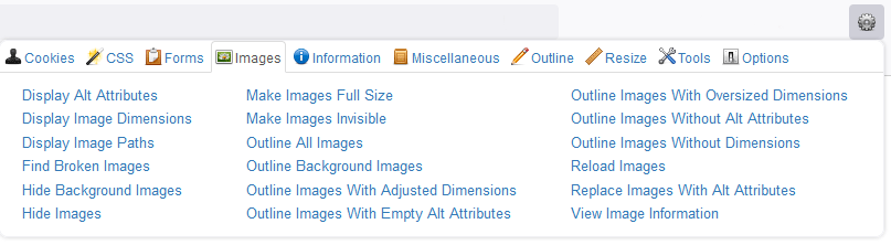
After installing and activating the extension in your web browser, its features are available to you. Click the icon of the Web Developer extension
(shown visually as a grey cog). A context window opens. Click the Images tab and then the
Display Alt Attributes option. This checks all regular image elements on the currently active web page, and in front of each image element the
visually highlighted text alt= appears, followed by the stored alternative text.
Graphic elements can also be embedded in other ways (e.g. via so-called pseudo-elements). Such approaches are not detected by this method. For normal everyday editorial work with regularly embedded images, however, the method shown here is perfectly sufficient.
Function of the graphic element
In principle, every graphic element should have a suitable alternative text so that the content of the image is accessible to everyone. Of course, there are exceptions to this rule, because a standard alternative text would not always be genuinely helpful. For editors, it can therefore be quite confusing at first to know when to write an alternative text, what it should say and when to leave it empty. Below you will find some examples that will hopefully make things clearer for you.
Graphic element: standard
You want to insert a photo, a comic or a logo that you use as an ordinary graphic element to enhance a text, show a product or represent a company brand on the website? As long as the graphic element has no further function, this is the standard case for alternative texts. Give the graphic element an alternative text that describes the image correctly.
Basic principles for the alternative text of a standard image
- Don’t add phrases such as “The image shows” or “The graphic contains”. Assistive technologies such as screen readers tell the person by themselves that it is an image.
- Describe objectively, briefly and concisely what can be seen in the image (the most important elements in it).
- After that, you can add more detailed information to the description that helps the person imagine the image more precisely.
- Use plain language without abbreviations, jargon or idioms to make the alternative text understandable for as many people as possible.
- Don’t write link addresses in the alternative text; put them in the surrounding text outside the image.
- Don’t put your personal interpretation into the alternative text; stay objective in your description. Assume that the person wants to form their own opinion.
- Don’t stuff the alternative text with keywords for search engines; write readable sentences for people. This also works better for high-quality search engine optimisation.
These basic principles are only meant as rough guidelines. In the end, it always depends on the context a graphic element is in:
- If, for example, the target audience visiting the website consists exclusively of experts, using technical terms in an alternative text can provide more clarity than a paraphrase would.
- If you know that the website’s primary target group is autistic people (who can of course also be experts), it can be particularly helpful for them if you make sure to use unambiguous language without idioms.
- A purely objective description can sometimes also be a hindrance and fail to convey the full content and, in particular, the emotions or special features of an image. The better you know the rules for alternative texts, the better you will know when it makes sense to deviate from them deliberately and sensitively in order to give the target audience a more helpful rendering of the image via the alternative text.
As soon as the graphic element is used only decoratively or as a graphic link, is a graphic part of a button, or triggers some other action, it is no longer the standard case. More on this in the following explanations.
Depending on the graphic type, there are also further tips on how to write better alternative texts specifically for symbols, drawings, charts or infographics.
Graphic element: used as decoration
In some cases, a graphic element is used purely for decoration. An example of such a decorative graphic on a website would be a pattern that is only included for visual reasons but serves no purpose in terms of content. These purely decorative elements are given an empty alt attribute. As a result, assistive technologies such as a screen reader ignore the decorative graphic.
Make sure that the alt attribute for purely decorative graphics is empty.
It must not contain any spaces or other characters!
- Wrong:
alt=" " - Correct:
alt=""
Please don’t get the idea of leaving out the alt attribute entirely for decorative graphics! If a graphic element has no alt attribute, many assistive output devices automatically read out the (often not very meaningful) file name instead, so the person would be bothered with useless information.
Graphic element: used as a link
When you link a graphic element, its task and function become those of a link.
In this case, the image’s alternative text should describe the link target instead of the image content.
But what if the link contains not just the image but also text? Or if the image shows relevant information that would be lost if only the link target were named? Here it is your task as an editor to consider how and whether you give the person all relevant information in the alternative text. To make this task easier for you, here are some typical use cases:
Example 1: link with logo
Situation
You want to link the logo to the homepage of the fictitious Demobar.
Solution
Since the logo has the function of a link, you don’t describe the content of the graphic but the link target.
Wrong:
<a href="https://www.demoziel.de">
  <img src="logo-demobar.svg" alt="Cocktail glass with the lettering Demobar">
</a>

Correct:
<a href="https://www.demoziel.de">
  <img src="logo-demobar.svg" alt="Demobar homepage">
</a>
Example 2: link with logo and text
Situation
You want to link the logo to the homepage of the fictitious Demobar. The link also contains text.
Solution
As in example 1, the logo has the function of a link. However, there is further content in this link. You need to check whether
the additional content – in this case a text – clearly names the link target and whether the image contains no content that would offer relevant added value if it were described.
Once that is clear, the goal is achieved: the person is informed about the link target by the text. It would be a distracting duplication if you also named the
link target in the logo’s alternative text. The logo only serves as decoration and is therefore given an empty alternative text.
Wrong:
<a href="https://www.demoziel.de">
  <img src="logo-demobar.svg" alt="Demobar homepage">
 Demobar homepage
</a>
Correct:
<a href="https://www.demoziel.de">
  <img src="logo-demobar.svg" alt="">
 Demobar homepage
</a>
Example 3a, simple version: link with image (with additional information) and text
Situation
You have a link that contains the PDF logo and, as text, the title of the file’s content and its size.
Solution
The link target is already described by the title text, so this information no longer needs to be in the logo’s alternative text. Ideally, in this example the text also states the file size. This is important information for the person, so that they know how large the file is before clicking the link (important for people with slow or data-capped internet connections). The logo tells you that it is a PDF file. Its alternative text must therefore contain a note to this effect.
Wrong:
In this wrong version, the editor first recognised that the link already contains the information about the link target through its text. But then the image was declared a decorative graphic through the empty alternative text. The relevant information contained in the image, “PDF file”, was not named.
<a href="https://www.demoziel.de/demodatei.pdf">
<img src="pdf.svg" alt="">
Sample topic (1 megabyte)
</a>
 Sample topic (1 megabyte)
Correct:
<a href="https://www.demoziel.de/demodatei.pdf">
  <img src="pdf.svg" alt="PDF file">
  Sample topic (1 megabyte)
</a>
Example 3b, more complex version: link with image (with additional information) and heading
Situation
You have linked to an event. The link contains text with the title of the event and the image of the venue. Across the photo of the venue, the image shows the information “Event postponed!”.
Solution
As in example 2, the link target is already named by the text (event title). This time, however, the image does not serve only as decoration; the note that the event has been postponed was embedded in it. This is important additional information in the image, which you therefore put in the alternative text. One could also argue that some people recognise the specific venue from the image and that this is also additional information that belongs in the alternative text. Here, however, it would be wiser to name the venue in text form in general, as even sighted people can only recognise this information visually if they know the place.
Note on “text in graphics”
You should not embed notice text exclusively in an image, but provide it as regular text on the web page. I deliberately chose this example because it is common on the internet and I want to show you how you as an editor can make it more accessible. If you have a fairly free hand, I would recommend that you include the cancellation of the event and the venue as text, e.g. in the heading. That way, people who view the website at a very high zoom level could have the text scale cleanly along with it.
Wrong:
In this wrong version, the editor first recognised that the link already contains the information about the link target through the text inside it. But then the image was declared a decorative graphic through the empty alternative text. The relevant information contained in the image, “Event cancelled”, and the venue are not named.
<a href="https://www.demoziel.de">
  <h6>Sample event</h6>
  <img src="Musterveranstaltung-abgesagt.jpg" alt="">
</a>
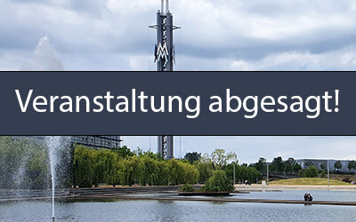
Wrong:
In this wrong version, what can be seen in the image is described. However, the actually relevant information, “Event cancelled” and the specific venue, is not named. The person is thus denied essential information while being given information that is not relevant to this use case.
<a href="https://www.demoziel.de">
  <h6>Sample event</h6>
  <img src="veranstaltung-abgesagt.jpg" alt="The focus is on a transmission tower with the lettering MM. In front of it is an artificial lake with a water fountain. In the middle of the lake, two people are standing on a path that runs through the divided lake. The area around the lake has been planted with many trees and plants. Next to the transmission tower is a large glass building. Further buildings can be seen in the background.">
</a>
Correct:
<a href="https://www.demoziel.de">
  <h6>Sample event</h6>
  <img src="veranstaltung-abgesagt.jpg" alt="Event at the demo venue cancelled!">
</a>
Correct (even better):
<a href="https://www.demoziel.de">
  <h6>Event “Title of the sample event” at the demo venue cancelled!</h6>
  <img src="veranstaltung-abgesagt.jpg" alt="">
</a>
Graphic element: used as a button
When you integrate a graphic element into a button, its task and function become those of a button.
In this case, the image’s alternative text should describe the function instead of the image content.
Just as with linked images, the topic becomes more complex when the button also contains text. Once again, it is your task to take a closer look at the situation and consider how you can give the user all relevant information without overwhelming them with unnecessary information.
Example 4: button with image
Situation
You insert a button with a symbol image that starts the search when clicked.
Solution
Since the symbol image has the function of a button, you don’t describe the content of the graphic but the function that is triggered when the person clicks the button.
Wrong:
<button type="button">
  <img src="suche.svg" alt="Magnifying glass">
</button>
Correct:
<button type="button">
  <img src="suche.svg" alt="Search">
</button>
Example 5: button with image and text
Situation
As in example 4, you insert a button with a symbol image that starts the search when clicked. This time, however, it also contains the text “Search”.
Solution
In this case, the image has the function of the button that starts the search when clicked. However, this function is already sufficiently described by the text that is also in the button. The symbol image therefore becomes a purely decorative graphic and so has an empty alternative text.
Wrong:
The function of the button is correctly described by the text it contains. However, the image’s alternative text contains an image description that gives the person no informative added value regarding the button’s function. That is why this alternative text is wrong.
<button type="button">
  <img src="suche.svg" alt="Magnifying glass">
  Search
</button>
Wrong:
The function of the button is correctly described by the text it contains. However, the image’s alternative text also contains the description of the function. That is an unwanted duplication.
<button type="button">
  <img src="suche.svg" alt="Search">
  Search
</button>
Correct:
The function of the button is correctly described by the text it contains. The image offers no informative added value, so it is a decorative graphic and therefore has an empty alternative text.
<button type="button">
  <img src="suche.svg" alt="">
  Search
</button>
Alternative texts for different graphic types
Alternative text for photos
If you insert an informative photo without any further functions, you can follow the basic principles for alternative texts. They apply equally to the photo of a politician in a newspaper article, the photo of a cat for social media and a product photo in an online shop alike.
If you describe a person in the image, the following characteristics may be of interest for the alternative text.
- What is the person’s name?
- What gender is the person? Unless the person has officially stated their gender, it is better not to mention it. Be careful with gender information to avoid misgendering.
- What profession/activity does the person have? Only mention this if it is relevant to the image. Ask yourself whether the profession/activity can be recognised in the image (uniform, astronaut suit, religious insignia, model, etc.) or whether the person is a public figure, so that viewers know their profession).
- In what situation and setting was the photo taken (e.g. in the plenary chamber of the German Bundestag, on a busy shopping street, at a conference, on a catwalk)?
- What posture and facial expression does the person have?
- What clothes is the person wearing? Keep this information brief unless it is particularly relevant.
- Roughly how old is the person (child, teenager, adult, senior)?
- From what perspective was the photo taken (is it a portrait, a full-body shot, taken from a distance, etc.)
Pay attention to the context in which the photo is placed. Does the surrounding text already say something about the person? If so, try to avoid duplicating content. If, for example, the article already says that the person is a politician and the photo caption mentions that the photo was taken in the Bundestag, you no longer need to mention either in the alternative text.
Example 6: photo of an event
Situation
You publish this shot of a band’s musical performance at an event. What alternative text would you give the following photo?
Wrong: empty alternative text
<img src="brass-band.jpg" alt="">
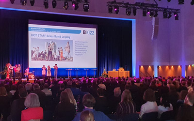
If you leave the alternative text empty, the photo has no alternative description of its content. People who cannot see the image therefore don’t know what the photo shows.
Wrong: alternative text too short
<img src="brass-band.jpg" alt="A band with an audience.">
This alternative text is too short! A lot of essential information is missing. In what setting and on what occasion is the band playing? How many people are in it?
What kind of music does it play? How many people are present?
With this alternative text, you can’t tell whether the Rolling Stones are giving a huge concert in front of tens of thousands of people in an open-air arena or
a school band is playing in the school hall in front of a few parents.
Wrong: keywords only
<img src="brass-band.jpg" alt="Band, Leipzig, library congress">
The alternative text contains no complete sentences. It gives the impression that it only contains keywords for search engines instead of being written for people. In addition, some important information is missing (which band, musical style, setting).
Correct: all relevant information included
In this correct version of the alternative text, you learn the number of people in the band, which instruments the brass band called “Hot Stuff” uses, where and in what context they are performing, and how large their audience is. This means all important information is included.
<img src="brass-band.jpg" alt="Nine members of the brass band Hot Stuff play wind instruments and a drum kit on stage at the Leipzig Library Congress 2022. The hall, which holds about 1000 people, is filled to the last seat.">
In this case, it is not necessary to name the individual wind instruments, because they can hardly be seen in the shot and the band is too far away to identify the wind instruments reliably. The name of the band and the event context, on the other hand, can be clearly read on the screen behind the band. That is why this information belongs in the alternative text.
Could you go into even more detail in the alternative text? Yes – once the basic information is included, many people appreciate it when the alternative text also contains further details that specify the setting and the mood of the image (e.g. the lighting, the arrangement on stage, the screen behind the band).
Correct: all relevant information included and a visible caption
Here the photo has a visible caption that already contains some important information. The informative alternative text doesn’t repeat this information but adds the other relevant details (number of band members, type of musical instruments, mention of the stage, information about the audience). Nothing is duplicated and nothing is left out.
<figure>
  <img src="brass-band.jpg" alt="Nine members of the band play wind instruments and a drum kit on stage. The hall, which holds about 1000 people, is filled to the last seat.">
  <figcaption>The brass band “Hot Stuff” plays for the audience at the Leipzig Library Congress 2022.</figcaption>
</figure>
Alternative text for symbols and icons
When symbols and icons are used in links or buttons, special rules apply.
But there are also use cases in which symbols are used as normal graphic elements without any further functions.
A very well-known example of this is emoticons. We know the famous symbol with the yellow circle and the recognisable smiling face on it as a
smiley. It is the most famous emoticon. We use them on social media, in text messages, emails and many other places.
Symbols and icons also need meaningful alternative texts. For many symbols, however, it would not be helpful to describe in detail what can be seen on them. What matters more is the information about what the symbol is meant to convey.
Example 7a: icon that symbolises “Save”
Situation
In a manual, you place the “Save” symbol, which is represented by a floppy disk.
Wrong: empty alternative text
<img src="floppy-disk.svg" alt="">

Without an alternative text, people who are visually impaired or blind won’t learn what kind of symbol it is.
Wrong: description of the symbol instead of its function
<img src="floppy-disk.svg" alt="Floppy disk">
The information that the graphic element is a floppy disk is not helpful in this case. Instead, it would be important to describe what the icon is meant to symbolise.
Correct (but often not ideal): description of the symbol’s appearance and function
<img src="floppy-disk.svg" alt="The floppy disk is used as a symbol for the save function.">
The alternative text contains the necessary information that this is about the save function. At the same time, the symbol itself is also described.
For icons, it is often more helpful to keep their alternative text as short as possible, because a description that goes beyond the function is often too distracting
in context and offers the person no relevant added value.
In the specific example of a manual or a guide, it can make sense to describe the symbol’s appearance in addition to its function when it first appears in the text or in a symbol overview. For all further uses, however, it is better to mention only the function. Why can it make sense here to describe the appearance once? Experience shows that sighted people in a training session, for example, mistakenly mention the appearance instead of the function (“click the floppy disk”). Then it is good if the visually impaired or blind person has at least heard once that the save function is represented visually by a floppy disk.
Correct: concise name of the symbol’s function
<img src="floppy-disk.svg" alt="Save">
The alternative text contains the necessary information that this is about the save function. Contrary to the usual practice, the alternative text is not written as a sentence, so that the person is not overloaded with information.
Example 7b: emoticon that symbolises “Evil thought”
Situation
You are writing a post with several emoticons and use the matching symbol (face with devil horns and an evil grin) to symbolise an “evil thought”.
For emoticons, it is important to keep the alternative text unambiguous and concise, because several emoticons are often used. If each of them has a long alternative text, this is hugely distracting from the actual content and is perceived as annoying rather than helpful. Otherwise, the same rules apply as in example 7a.
Correct: concise name of the emoticon’s function
<img src="evil.svg" alt="Evil thought">

The meaning of the emoticon is named. Because it is short, it doesn’t distract from the rest of the content.
Alternative text for drawings, illustrations and paintings
For drawings, illustrations and paintings, follow the basic principles for alternative texts. In addition, keep the following in mind:
- In what basic style (genre) is the drawing, illustration or painting created?
- What is the title of the work (if it has one)?
- What is the name of the artist?
- Are there any graphic features worth mentioning beyond the purely objective description (the artist’s personal style, elements of mood, colours)?
- For drawings, illustrations and paintings, be particularly careful to hold back personal judgements in the alternative text. Leave it to people to form their own opinion of it.
Alternative text for cartoons, comics and anime
The basic principles for alternative texts apply to cartoons, comics and anime. In addition, consider these points:
- It is by no means enough for the alternative text to say only that it is a comic strip. Describe the entire relevant content, panel by panel, the way readers take it in.
- Also describe the contents of the speech bubbles.
- Describe the artist’s personal style.
- Don’t interpret/judge the content in the alternative text; render it objectively, the way it can be seen.
Alternative text for memes
The basic principles for alternative texts apply to memes. In addition, there are the following special features:
- Memes often contain sarcasm and irony and play with ambiguous elements. If this is clear to you, it can make sense to start the description with a phrase like “An ironic meme …”. This helps some people to classify the following description correctly in principle, instead of taking it literally.
- Despite any sarcasm or irony that may be recognisable, describe the depicted content objectively and exactly (panel by panel, including any text it contains).
- If the meme can be misunderstood particularly easily, it can be helpful to then explain objectively, without judgement, what context the meme comes from.
Alternative text for charts/infographics
The basic principles for alternative texts also apply to charts and infographics. In addition, there are the following special features:
- Describing a complex chart or infographic is challenging. So concentrate in particular on naming only the most important facts at first. What are the key messages? Where is the focus of the content? Write a short summary of the graphic.
- If possible, describe the details of the chart in the article or content in which the chart is embedded. If you can do that, you can limit the alternative text to the summary and point out that the detailed description is in the article.
- State the source of the chart/infographic, unless this is already explained in the surrounding text.
- Describe the chart type (column, pie, bar, line, etc.).
When you use a chart on social media, you usually don’t have enough characters available to explain it in the accompanying text.
In that case, write as many of the key messages as possible into the chart’s alternative text. If possible, link in the accompanying text to a page
containing the detailed text description of the chart.
In this case, it is not good to just mention in the alternative text that it is a chart and refer generally to the external page. That forces
people to visit the external page instead of at least telling them the key messages in the graphic’s alternative text on the social network itself.
Alternative texts in search engine optimisation
In the early days of the internet, it was common to misuse the alternative text of images for search engine optimisation. The emphasis is on “misuse”, because the alternative text was filled with masses of keywords that all too often had nothing to do with the content of the graphic element. Fortunately, modern search engines are now quite good at recognising this and penalise such behaviour.
Search engines such as Google and Bing point out very clearly that they expect alternative texts to be written for people. So it is definitely the case that search engines now also reward you for using alternative texts for exactly the purpose they were always intended for. If you give your photos high-quality alternative texts, the likelihood increases that the content will appear in the so-called organic search engine results and in image searches.
If you have several similar images on a page (e.g. from an event), make sure that you give each image its own individual alternative text. This is more pleasant for your visually impaired and blind readers and also keeps the search engines happy.
What do #BiBesch, #ALT and !B mean?
On social media, you may already have come across hashtags such as #BiBesch and #ALT or the abbreviation !B (an exclamation mark followed by a capital B without a space). But what do they mean?
- #BiBesch
- Sometimes the alternative text has been forgotten for an image on social media. You can write a comment under the post in which you describe the image and put the hashtag #BiBesch (short for the German Bildbeschreibung, “image description”) at the end of the description. This makes it easier for sighted and blind users to find the added image description. This abbreviation is only common in German-speaking countries.
- #ALT and !B
- These tags are (optionally) sometimes added to the end of social media posts that contain a photo (with an alternative text set). On the one hand, this is meant to make these posts easier to find; on the other hand, it is also meant to make sighted users aware that the image has an image description.
